
Case Study
Pharmacy Cart Redesign
If we were a spy movie, the Pharmacy Cart would have been the President - whom we’d have to save at all costs!
Role /
Lead Designer
UX Researcher
Duration /
3 months
Year /
Dec '21-Feb '22
So yes, the cart page is highly crucial. Customer drop-offs at this screen are a point of concern. As our company started to grow a lot of new elements, marketing programs, banners and new features were added to it. As a result, it became cluttered and slightly unorganised.
My Role
I was the lead designer on this project. I worked along with my project manager. It was supposed to be a UI project but we ended up fixing the UX issues as well. I took up UX research, UI design as well as user testing (of prototypes). I also collaborated with developers to ensure that the implemented design was pixel perfect.
A loud shout out to my team 🥳. View their names here!
We had a
Conversion Rate of
...and so the Research Began!
35%
-
Improve Conversion Rate
-
Reduce dropoffs
Initial Problem Statement:
Our primary sources of information were:
-
Customer Calling
-
Complaints raised via our Help Section
We called about 100 customers who had painstakingly prepared their cart and proceeded to the cart page but did not complete the transaction.
-
We asked them about what went wrong?
-
We asked them how they bought medicines online?

Pic: Brief Summary of the Customer Calling
Research: Key Findings
Behaviour Centric Insights
How do People Buy Medicines Online?
How do People Buy Medicines Online?
How do People Buy Medicines Online?
How do People Buy Medicines Online?
Insight 1:
People often feel exhausted after buying medicines, because:
-
Medicines are Homogenous items
-
Don’t have exclusivity
-
You can buy it from here or any other website
-
-
Medicine purchases are often expensive
-
Dealing with different kinds of discount combinations - (on each website they care to venture)
// choice overload
(where to buy from?)
// no impulse buy
// decision fatigue
Insight 2:
Discounts are often the deciding factor:
-
People tend to prepare the same cart on multiple platforms
-
They apply available offers to reduce the price to a minimum
-
Compare the cart value and go ahead with the online pharmacy that offers the lowest price
// multiple online
pharcmacies
Platform Centric Insights
How do people view the Apollo 247 Pharmacy?
-4.png)
Unstructured Information
Users felt overwhelmed with the information provided. They often missed out on applying discounts and other offers
-1.png)
Ambiguity towards address change
-
How do I change my address
-
Always miss out on change address, as a result my whole cart gets affected
-2.png)
How to get a free prescription?
It wasn’t clear to users that people without a prescription could get a free prescription. They added to the total drop-offs.
.png)
Invoicing issues
Users would often raise requests after placing an order - to change the name against which the bill was made
-3.png)
Coupon related issues
Not clear at a glance whether a coupon is applicable or not
How much savings is a coupon offering?
User Groups
Next, we grouped our users into all possible categories, so that no use case was missed while putting the components and flows together
NOTE: 'Circle' is a subscription plan that we offer our customers.
Step 4: Add/Choose Address
(Action taken)


Step 1: Usage frequency
(Inherent property)
Step 2: Type of User
(Inherent property)
Step 3: Type of Medicines
added to Cart
(Action taken)
Flowchart: Different User Groups
Existing Scenarios
Since I was completely new to the Pharmacy cart flow I started making a list of existing use cases. It was a long list which I later segregated into:
Primary flows - upload prescription, review order, split-order, etc.
Secondary flows - address, coupons, etc.
Edge cases - auto-upload prescription, subsidised delivery, etc.
Errors and blockers - nudges, item no longer available, Insufficient cart amount, delivery prompts, etc.
Redundant - Kerbside pickup, etc.
Design Brief
Aim to improve conversion rate during the cart flow by providing a better user experience, such that the customer that currently struggles to place an order can clearly distinguish between primary and secondary information.
APPROACH
Let the Designing begin....
Now that we had all the key ingredients:
-
Problems identified
-
User groups
-
Existing scenarios

Pic: 'Component, flow, testing' approach
We began the design process. We broke the entire cart into components and tackled it one component at a time. Once we had a sufficient grip over the major components we started working on the flows. Once a flow would get completed we would test the Figma prototype on users. Depending on their feedback we would revisit the flow and sometimes even the components.
Components

Pic: New Sticky Footer - Shows final amount to pay
1. FOOTER
Offer 'Price Comparability'
We understood that we couldn't stop our customers from comparing prices on other websites. So we made sure:
Our final price was clearly visible at all times
Variartions:


BEFORE:
Old Sticky Footer

Pic: One section with all the options to reduce cart price
2. OFFERS & DISCOUNTS SECTION
Support users to get to the Best Price
Available Health Credits (HCs) were earlier shown on the payment page. We often gave people promotional HCs, where 1HC was equal to 1rupee. But people ofter dropped off at the cart page before they could realise that they had more discount waiting for them. So we brought the HC section forward!
We put all methods to reduce cart value in one place (discounts, subscriptions, health credits, etc.)
Variartions:


Pic: Old Design - Address was part of the sticky footer

Pic: New Design - Billing name & address details moved to the top
i.) Invoicing related issues
The name against which items are billed is very important because often people get reimbursed from their organisations for medicine purchases. So the billing name needs to be accurate and in compliance with the prescription name.
Earlier we didn't show the name on the cart screen! We showed it on the next screen (review order) but to change it the user would have to go back to the cart. Even there, changing the name was not intuitive. As a result, we received a lot of requests on our help portal to change the billing name.
We made sure:
-
The billing name was visible in the first fold
-
CTA to change it was clearly visible
ii.) Ambiguity related to address
Change in address affects:
-
Availability of the item
-
Price of the item (in some cases)
-
Promised delivery time
So if the user changes the address on the review order page, every important detail changes on the cart page - items may become out of stock, delivery time may increase - and if any of these variables affect the user’s decision making process - all his effort goes down the drain
3. ADDRESS SECTION
Other Components


Pic: 'Before' and 'after' versions of different components
Flows
There are primarily 4 important flows while preparing a cart:
-
Happy flow
-
Address flow
-
Upload prescription flow
-
Apply Coupon flow
1. Happy Flow

Video: Happy Flow
2. Address Flow
Add Address
Edit Address
Delete Address


Video: Adress Flow
3. Upload Prescription Flow

Flowchart: Medicine purchase Flow
If the user has a prescription
If the user doesn't have a prescription


Video: Upload Prescription Flow
4. Apply Coupon flow
'View more' to see more coupons:
Coupons weren't visible in one glance.
Click on each coupon to find out the total savings:
Applicable coupons benefits were conveyed to the customer only after they applied a coupon.
Click on each coupon to find out whether they are applicable or not

Pic: Old design - Coupon flow

Pic: New design - Coupon flow
Reordering Coupons:
Showing the coupon with the most savings first
Showing total savings upfront:
To speed up the decision-making process - we started showing the savings upfront. Customers could compare and choose.
Showing why a coupon is not applicable:
Inform the customer about the possible action they could take to remedy this
New Features
1. Auto- Uploaded Prescriptions
We made the customer's work a little easy. If the customer has previously ordered Rx medicines from us and has previously provided a prescription - we save it for them! So that the next time he orders the same medicines - we auto-upload the prescription for him. Saving the customer the hassle of going through the ‘Upload prescription’ flow.
Repeat Customer
Has previously bought Rx Medicines from us, which means:
-
They have a prescription
-
We have verified it too
Reduce a step - no need to go through the ‘Upload Prescription’ flow
We auto-detect old medicines and auto-upload prescriptions for them
Cart with medicines that require a prescription

Pic: Cart with item(s) marked 'Rx'

Auto-uploaded prescription
Pic: Auto-upload verified prescription
2. Additional options to Upload a Prescription
The drop off rate at ‘Upload Prescription’ was quite high. We realised it was an additional step - which was intimidating for some and difficult to comprehend for others.
1. Sometimes prescriptions, especially the older ones got lost or weren’t handy at the time of placing an order. So the whole ordering process stops until you have it.
2. For certain medicines it was easier to go and buy them from a local pharmacist - no ‘prescriptions’ asked, rather than buying via an online platform.
We introduced two methods:
2a.) Share Prescription later via Whatsapp:
This way the customer went through with the ordering process - and uploaded the prescription at his own convenience.

Pic: 'Share prescription later via Whatsapp' Flow
2b.) Remove Rx medicines and proceed:
So for those who found this whole process inconvenient - we allowed them to drop the Rx items from their cart and proceed with the other items while continuing to avail benefits and discounts on them.

Pic: 'Remove Rx medicines and proceed' Flow
Unfortunately, we weren’t able to go ahead with these options in the current sprint due to some constraints. But we will be able to bring these features in, in the future.
3. Set Refill Reminders
Equipping customers to never run out of medicines again!
Once the customers were happy with their cart and they would proceed towards the ‘Review Order’ screen - we offered them an option to set reminders for items in their cart.
They could select the item(s) they frequently bought and set the duration (the time it took to consume the item). There are two ways to go about it:
1. Customise with Personal Data: The customer could set the duration according to their needs - for example, it takes a customer's child a month to finish a 400g pack of Baby food - the customer can input this data.
2. Use Global Averages: Alternatively, the customer could let us set the duration that would be based on global averages
After that, we would alert the customer over WhatsApp when his refill date was nearby. We would also send him a pre-made cart and all he’d have to do was to make the payment.


Pic: 'Set Refill Reminders' Flow
4. Price Update
Providing better information
If there was a change in the price of items in the cart - we would inform the customer of the change.
We found that there were a few issues with it:
-
Customers didn’t know which items had a change in their price
-
They didn’t know by how much the price had changed
We made this information visible to the customer:


Pic: Old design
Pic: New design

Pic: Alert for increase in price
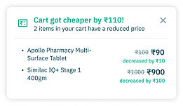
Pic: Alert for decrease in price
Research-based learnings
-
Online Pharmacy apps - are a need not a want. Sometimes we behave like e-commerce but we are a little more serious business than that.
-
Online pharmacies need to work on building trust
-
Currently, the main attraction is discounts and cashback - we should work towards changing that to convenience and good service.
-
Offline pharmacies work on trust:
-
If I am a pharmacist and you are my regular customer - I will not ask you for a prescription for certain medicines - because I know you and trust you and we share a rapport.
-
If you are a regular customer - and you’ve bought your chronic medicines from me. If a situation arises wherein your doctor changes your medicines, I will take back your old medicines and give you your new medicines in their place. In the case of an online pharmacy - all the old medicines go waste - they cannot be utilised because there is no exchange or take back or there are time limitations.
-
-
Shout out to my entire team that made this project possible 🥳
Product team:
Riti
Kranthi
Rishav
Amogh
Dev & QA team:
Sumit
Suman
Mayank Narula
Ashu
Rahul K
Gowthami
Shikha
Ishawari
Narendra D
Shuvam G
Suryans
Tejaswi G